
Making Accesible Research
Posted 03/08/2026
If you can't explain it simply, you don't understand it well enough - Albert EinsteinThis tutorial is centred around this very website. Under my development page I post my research milestones. Papers are great for recording knowledge, but often the knowledge gets cut short because of page limits, or work gets taken out because it didn't end up as part of the story. Sometimes it is nice to decide yourself what research you want to show others. And more importantly, make that research clearer through interactive displays rather than the paper format we base research dissemination on from hundreds of years ago. Data samples should be accessible, plots should be interactive and the reader should actually understand what you have done by the end - without the need to digest the paper in a journal club.
This tutorial suggests a few methods of making your research more accesible through website form. You can make use of our javascript package that you can download here: Javascript package
Contents
Interactive Data Visualisation
When presenting scientific results, plots are often included as static images or screenshots. While this is convenient for a traditional paper, static figures remove much of the information contained within the original data. A screenshot shows only one viewpoint, one selection of data, and one set of visual settings chosen by the author.
Interactive plots allow readers to explore the data themselves. Instead of looking at a fixed image, users can rotate 3D plots, zoom into regions of interest, hide or reveal different parts of the data, and examine individual examples. This creates a more transparent and engaging way of communicating results.
Why Use Interactive Plots?
Interactive visualisations are particularly useful when working with complex datasets. For example, a machine learning model may produce thousands of predictions, or a motion capture system may record hundreds of marker positions over time. A single static image cannot show all of this information without becoming cluttered.
Instead, we can allow the reader to interact with the data and decide what they want to investigate.
- Explore different examples: Instead of displaying one example from a dataset, users can cycle through many samples.
- Change the viewpoint: 3D data can be rotated and inspected from different angles.
- Compare multiple sources: Predictions can be shown alongside ground truth measurements.
- Reduce clutter: Users can hide information they are not interested in.
- Improve reproducibility: Readers can directly inspect the evidence behind reported results.
Loading and Displaying Data
In this example, JavaScript is used to load data from a CSV file and convert
it into a format that can be displayed as a 3D plot. The CSV file contains
marker positions, where each marker has an x, y,
and z coordinate.
The loadCSV() function automatically finds marker columns,
extracts their coordinates, and converts each row into a collection of
3D points.
function loadCSV(url){

    return new Promise((resolve) => {

        Papa.parse(url, {
            download: true,
            header: true,

            complete: function(results){

                let data = results.data;

                // Extract marker positions
                // Convert rows into 3D points

                resolve(samples);

            }

        });

    });

}
Once the data has been loaded, it can be displayed using an interactive plotting library such as Plotly.
Displaying the Plot on the Webpage
Before JavaScript can draw a plot, the webpage needs a location where the
visualisation will be placed. This is done by creating an empty HTML
container with a unique id.
The JavaScript code uses this ID to find the correct location on the page and insert the interactive plot.
<div
    style="width:300px; margin:auto;"
    class="plot-container"
    id="plot_cnn">
</div>
This creates an empty box on the webpage. The plot is not stored inside the HTML itself; instead, JavaScript dynamically fills this container with an interactive Plotly figure.
The id must match the ID provided when creating the plot in
JavaScript.
createPlot(
    "plot_cnn",
    "plot_cnn"
);
Here, the first value ("plot_cnn") is the name used to keep
track of the plot, while the second value identifies the HTML element where
the plot should appear.
Creating an Interactive Plot
Rather than generating a static image, we create a plot object that can receive new data. This means the same plot can be updated repeatedly without needing to reload the webpage.
createPlot("plot_cnn", "plot_cnn");

addMarkers(
    "plot_cnn",
    truthSamples[0],
    "blue"
);

addMarkers(
    "plot_cnn",
    predictionSamples[0],
    "red"
);
In this example, blue markers represent the true positions and red markers represent the model predictions. Because the plot is interactive, the user can rotate the scene and examine where the prediction differs from the ground truth.
Processing Data from a CSV File
Experimental data is often stored in a table format, such as a CSV (Comma-Separated Values) file. CSV files are commonly used because they are simple, portable, and can be opened by many different programs including Excel, MATLAB, Python, and statistical software.
However, a CSV file is not immediately suitable for visualisation. The data first needs to be loaded, organised, and converted into a structure that the plotting library understands.
In this example, the CSV file contains 3D marker positions. Each marker has three values representing its position in space:
marker_1_x, marker_1_y, marker_1_z,
marker_2_x, marker_2_y, marker_2_z,
marker_3_x, marker_3_y, marker_3_z
Each row represents one sample or frame of data. For example, in a motion capture experiment, each row could represent one moment in time.
Sample 1:
marker_1 = [x, y, z]
marker_2 = [x, y, z]
marker_3 = [x, y, z]


Sample 2:
marker_1 = [x, y, z]
marker_2 = [x, y, z]
marker_3 = [x, y, z]
Loading the CSV File
The first step is loading the CSV file into the webpage. Because files are loaded from the internet or the local server, this happens asynchronously. This means the browser starts loading the file and continues running other code while it waits for the data.
The function therefore returns a Promise, which allows the rest
of the program to wait until the data is ready.
function loadCSV(url){

    return new Promise((resolve) => {

        Papa.parse(url, {

            download: true,
            header: true,

            complete: function(results){

                let data = results.data;

                resolve(data);

            }

        });

    });

}
The header:true option tells Papa Parse that the first row of
the CSV contains column names. This means we can access values using their
column names rather than remembering their position.
Finding Marker Columns
Rather than manually writing every marker name, the function automatically
searches the CSV headings for columns containing the word
"marker".
let markerColumns = Object.keys(data[0])
    .filter(col => col.includes("marker"));
For example, this converts:
[
    "time",
    "marker_1_x",
    "marker_1_y",
    "marker_1_z",
    "marker_2_x",
    "marker_2_y",
    "marker_2_z"
]
into:
[
    "marker_1_x",
    "marker_1_y",
    "marker_1_z",
    "marker_2_x",
    "marker_2_y",
    "marker_2_z"
]
This makes the code flexible because it can handle datasets with different numbers of markers without needing to be rewritten.
Extracting Marker IDs
The next step is identifying which markers exist. The function extracts the marker number from each column name using a regular expression.
col.match(/marker_(\d+)/)[1]
For example:
| Column name | Extracted ID |
|---|---|
| marker_1_x | 1 |
| marker_12_y | 12 |
| marker_25_z | 25 |
The IDs are then sorted numerically so that markers appear in the correct order.
markerIDs.sort((a,b)=>a-b);
Converting Rows into 3D Points
Plotting libraries do not understand CSV tables directly. They require the data to be converted into arrays of coordinates.
The function loops through every row in the CSV and creates an array of 3D points.
let samples = data.map(row => {

    let markers = [];

    markerIDs.forEach(id => {

        markers.push([
            Number(row[`marker_${id}_x`]),
            Number(row[`marker_${id}_y`]),
            Number(row[`marker_${id}_z`])
        ]);

    });

    return markers;

});
For example, one row of CSV data:
marker_1_x = 10
marker_1_y = 25
marker_1_z = 5

marker_2_x = 15
marker_2_y = 20
marker_2_z = 8
becomes:
[
    [10, 25, 5],
    [15, 20, 8]
]
This is the format required by the plotting function. Each inner array represents one point in 3D space:
[x coordinate, y coordinate, z coordinate]
The Final Data Structure
After processing, the entire CSV file is converted into a list of samples:
samples = [

    // Sample 1
    [
        [x1,y1,z1],
        [x2,y2,z2],
        [x3,y3,z3]
    ],

    // Sample 2
    [
        [x1,y1,z1],
        [x2,y2,z2],
        [x3,y3,z3]
    ]

]
This structure allows the webpage to easily display different examples by selecting a different sample index:
addMarkers(
    "plot_cnn",
    samples[currentSample]
);
The key idea is that the CSV file is transformed from a human-readable table into a computer-friendly structure that can be efficiently explored, plotted, and updated interactively.
Viewing Multiple Examples
A common problem with machine learning and experimental datasets is that showing one example does not represent the full range of results. A model may perform well on some samples and poorly on others.
Instead of creating hundreds of separate figures, we can provide a button that updates the plot with a different example.
<button class="buttonF"
        onclick="nextExample_cnn()">
    See Other Examples
</button>
The button calls a JavaScript function which increases the current sample number, clears the existing plot, and displays the next example.
function nextExample_cnn(){

    currentSample_cnn++;

    if(currentSample_cnn >= truthSamples.length){
        currentSample_cnn = 0;
    }

    createPlot(
        "plot_cnn",
        "plot_cnn"
    );

    addMarkers(
        "plot_cnn",
        truthSamples[currentSample_cnn],
        "blue"
    );

    addMarkers(
        "plot_cnn",
        predictionSamples[currentSample_cnn],
        "red"
    );

}
This simple interaction turns a single figure into a complete exploration tool. A reader can inspect many different examples without leaving the page.
Interactive Controls Beyond Changing Samples
Buttons do not have to only change which example is displayed. They can be used to control almost any aspect of the visualisation.
For example, a dataset may contain multiple classes. Instead of displaying everything at once, buttons can allow users to show or hide specific groups.
<button onclick="showClass('walking')">
    Show Walking
</button>

<button onclick="showClass('running')">
    Show Running
</button>

<button onclick="hideAll()">
    Clear Data
</button>
Other useful interactive controls include:
- Filtering: Remove certain classes, subjects, time periods, or experimental conditions.
- Comparison toggles: Switch between different models, algorithms, or experimental settings.
- Sliders: Move through time-series data frame-by-frame.
- Colour controls: Change colours based on error, confidence, or category.
- Visibility controls: Hide predictions, raw measurements, annotations, or intermediate results.
Moving Beyond Traditional Figures
Interactive plots change the role of a figure from something that only communicates a final result into something that allows readers to investigate the data themselves.
This is particularly valuable for modern computational research, where datasets and models are often too complex to summarise with a single image. By embedding interactive visualisations directly into webpages, researchers can provide both the high-level story and the detailed evidence behind it.
A static plot answers: "What result did the author choose to show?"
An interactive plot allows the reader to ask: "What happens if I look at another example, another class, or another part of the data?"
Adding Links, Images, GIFs, Audio and Video
Unlike a paper document, a webpage can link directly to other websites, documents, or research papers. This allows readers to quickly access additional information without having to search for it themselves.
Hyperlinks are created using the <a> (anchor) tag.
<p>
    Read more about HTML on
    <a href="https://developer.mozilla.org/" target="_blank">
        MDN Web Docs
    </a>.
</p>
hrefspecifies the destination.target="_blank"opens the link in a new browser tab.
Embedding Images
Images are added using the <img> tag.
<img src="images/cat.jpg"
     alt="A sleeping cat"
     width="400">
The src attribute tells the browser where to find the image,
while alt provides a description if the image cannot be displayed
and improves accessibility. The width attribute controls the
displayed size.
Common image formats include:
- .jpg / .jpeg - Best for photographs.
- .png - Supports transparency.
- .webp - Modern format with excellent compression.
- .svg - Vector graphics that remain sharp at any size.
Embedding GIFs
GIFs are embedded exactly like normal images because they are image files.
<img src="images/animation.gif"
     alt="Animated demonstration"
     width="400">
GIFs are useful for showing short animations or demonstrating a process. However, GIFs cannot contain sound and often have much larger file sizes than videos. If your animation is longer than a few seconds, a video is usually the better choice.
Embedding Audio
HTML can also play audio directly on your webpage using the
<audio> element.
<audio controls>
    <source src="audio/interview.mp3" type="audio/mpeg">
    <source src="audio/interview.ogg" type="audio/ogg">
    Your browser does not support the audio element.
</audio>
The controls attribute automatically provides play, pause and
volume controls.
Common audio formats include:
- .mp3 - Most commonly used.
- .ogg - Open format supported by modern browsers.
- .wav - High quality but much larger file sizes.
Embedding Video
When your media includes sound or lasts longer than a few seconds,
use the <video> element instead of a GIF.
<video controls width="640">
    <source src="videos/tutorial.mp4" type="video/mp4">
    <source src="videos/tutorial.webm" type="video/webm">
    Your browser does not support the video tag.
</video>
The controls attribute adds play, pause, volume and fullscreen
controls automatically.
Common video formats include:
- .mp4 - Recommended for almost all websites.
- .webm - Smaller file sizes with excellent browser support.
- .ogg - Less common but supported by some browsers.
Where Are These Files Stored?
Before HTML can display an image, GIF, audio file or video, the media must
exist somewhere that the browser can access. Usually, these files are stored
inside your website project in folders such as images,
audio and videos.
website/
│
├── index.html
├── images/
│   ├── cat.jpg
│   └── animation.gif
├── audio/
│   └── interview.mp3
└── videos/
    └── tutorial.mp4
Alternatively, media can be hosted online and linked using a full web address.
<img src="https://example.com/images/cat.jpg"
     alt="Cat">

<audio controls>
    <source src="https://example.com/audio/music.mp3"
            type="audio/mpeg">
</audio>

<video controls width="600">
    <source src="https://example.com/videos/demo.mp4"
            type="video/mp4">
</video>
Choosing the Correct Media
| Media | Best Used For |
|---|---|
| Image (.jpg, .png, .webp) | Photos, diagrams and screenshots. |
| GIF (.gif) | Short silent animations. |
| Audio (.mp3, .ogg, .wav) | Music, narration, interviews and sound effects. |
| Video (.mp4, .webm) | Tutorials, demonstrations, presentations and animations with sound. |
As a general rule, use an image for static content, a GIF for short silent animations, audio when only sound is needed, and video whenever your content includes sound or longer demonstrations. Modern video formats are usually much smaller and higher quality than GIFs for longer animations.
Enhancing the Supplementary
In traditional research papers, supplementary material is often used to provide additional information that supports the main work without interrupting the flow of the paper. This might include details such as hyperparameter searches, comparisons between different model architectures, ablation studies, or additional experimental results.
While this information is important for reproducibility and transparency, placing it in a separate supplementary document means readers must leave the main paper to find it. Many readers simply skip these sections, missing valuable context about how the results were obtained.
A webpage allows us to improve upon this idea. Instead of separating supplementary information into another document, we can embed it directly within the page where it is most relevant. Readers who only want the main story can continue reading uninterrupted, while those wanting more detail can reveal the extra information only when they need it.
One simple way to achieve this is with tooltips. A tooltip displays additional text, images, or diagrams when the user hovers their mouse over a highlighted word or phrase.
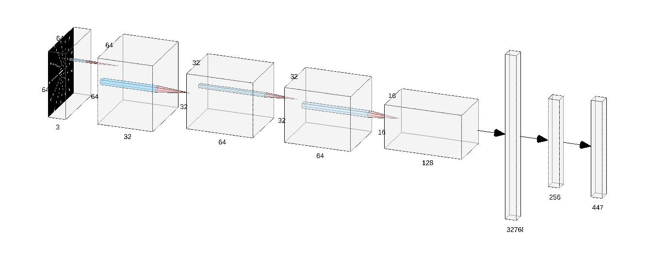
For example, rather than interrupting a paragraph to explain what a CNNThe CNN architecture consists of three convolutional layers followed by fully connected regression layers. The input tactile images (64x64x3) are processed using convolutional filters of size 3x3 with increasing feature depth (32, 64, and 128 filters), interleaved with max-pooling layers to reduce spatial dimensionality.
The extracted feature maps are flattened and passed through a 256-neuron dense layer before the final regression layer outputs the predicted 3D positions of 149 markers (447 values). The model is trained using Mean Squared Error loss and the Adam optimiser.
Tooltip HTML
Tooltips are created using nested <span> elements. The
outer span marks the word to hover over, while the inner span contains the
hidden supplementary content.
<span class="tooltip">
    <u>CNN</u>

    <span class="tooltip-text">
        Extra explanation goes here.

        <br><br>

        <img src="CNN.png" width="250">
    </span>

</span>
The tooltip can contain almost any HTML content, including paragraphs, images, lists, tables, equations, or even videos. This makes it an ideal way to include supplementary information exactly where it is needed.
Tooltip CSS
The following CSS hides the supplementary content until the user hovers over the highlighted word.
.tooltip {
    position: relative;
    display: inline-block;
    cursor: help;
}

.tooltip-text {
    visibility: hidden;
    opacity: 0;

    width: 500px;
    background: white;
    color: black;

    border: 1px solid #aaa;
    border-radius: 8px;

    padding: 10px;

    position: absolute;
    z-index: 999;

    left: 50%;
    bottom: 120%;
    transform: translateX(-50%);

    transition: opacity 0.2s;
}

.tooltip:hover .tooltip-text {
    visibility: visible;
    opacity: 1;
}
The CSS ensures that the supplementary information remains hidden while the page loads, only becoming visible when the user hovers over the highlighted text. This keeps the main page clean and easy to read while still making detailed explanations available exactly where they are most useful.
This technique is particularly effective for explaining technical terms, mathematical equations, model architectures, parameter choices, or any information that would otherwise interrupt the narrative of your article.